
Hello, and welcome to the resurrected Robert Hunter Performance Archive! I originally built this site in the late '90s as a way to document and share Hunter performances from circulating tapes and contemporary tours. I stopped updating the site after his 1998 tour, and by the mid-2000s the site was no longer online. In 2025 I developed a plan to rebuild and modernize the site leveraging modern technology to create a searchable database of known performances.
There is still a tremendous amount of work to do - corrections, additions, new recordings and sources - but I hope this early version of the site is a useful resource and a good start. If you have information, recordings, or corrections to contribute, please email me at dfresh@gmail.com. Enjoy exploring the legacy of Robert Hunter!
Get Updates!
If you'd like to be notified when new features are added, or when significant new data is added to the site, please consider subscribing to my newsletter. (This is a low-volume newsletter - I only send out an email when there is something significant to share. Use the RSS feed to track smaller, more frequent updates.)
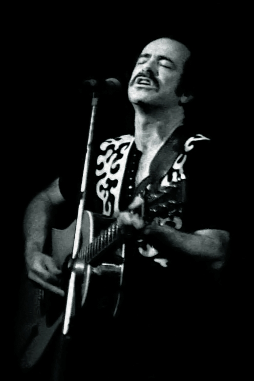
Philadelphia, early '80s - Photo by David Saddler (CC BY 2.0)